Sensor visualization updates
Cisco Meraki
Jun - Aug 2020
Summary
GIF of the launched visualization for the open/close sensor
Based on beta user feedback, I redesigned visualizations for 3 different sensor products to enable IT admins to quickly monitor and troubleshoot issues at different time ranges.
The designs account for improved usability and performance.
Sole designer working with a PM and 2 engineers.
Background
Network administrators and facilities teams oversee and protect business critical infrastructure like server racks and AV equipment that are susceptible to slight changes in their environment. The three Meraki sensors (MT) help these teams monitor for changes in temperature and humidity, water detection, and doors left open, which could result in business downtime or costly hardware replacements. Sensors send alerts when a condition goes over set thresholds, and people will then check the Meraki Dashboard to get additional information.
Illustration of Meraki sensors in a server room (source)
Problems
Initial ask
The team had already built an MVP that was in external beta testing when I started the project. To quickly get sensor data into production for MVP, they used an existing line graph component for all sensors’ data visualizations. They anticipate the data will quickly outgrow the line graphs as we plan for future features. For example, we currently show data up to the last 30 days— how can we represent data at larger time ranges, like the last year, when it will need to be downsampled for better performance?
Beta sensor details page for a temperature and humidity sensor
Beta user feedback
On sensor readings:
“Seeing the current temperature is nice, but I need to see context. Is it just a 1 degree variation that doesn’t matter much? Was there a power outage over the weekend?”
On long term usage:
“The school turns off AC for extended periods or weekends, so the readings might help them analyze usage and optimize for different seasons, and catch any HVAC problems that could affect the hardware.”
Example of an open-close sensor graph where events squeeze together into a large block
Additionally, people found it difficult to mouse over into specific data points on the graph because of the nature of using binary data on line graphs for the water detection and open door sensors. When zoomed out to a large time range, the graph shows individual events as a large block.
Reframing the initial ask
Network admins need summarized data and historical context to quickly assess the severity of the issue because the potential next steps have varying degrees of impact and effort, e.g. If the alert is an actual emergency, I need to go on site or call my facilities team. If the alert is part of a larger trend, I may need to investigate how our HVAC system or other external factors may be affecting the environment. If the alert is the result of an overly-sensitive threshold, I can adjust the threshold to receive less alerts.
Network admins need data presented in a way that is meaningful at each time range and for each sensor model.
Solution
MT 10, temperature and humidity sensor
Before
The performance of the page slows when loading all data points from the last week and month
Key data points highlighted to the right of the graph lack hierarchy
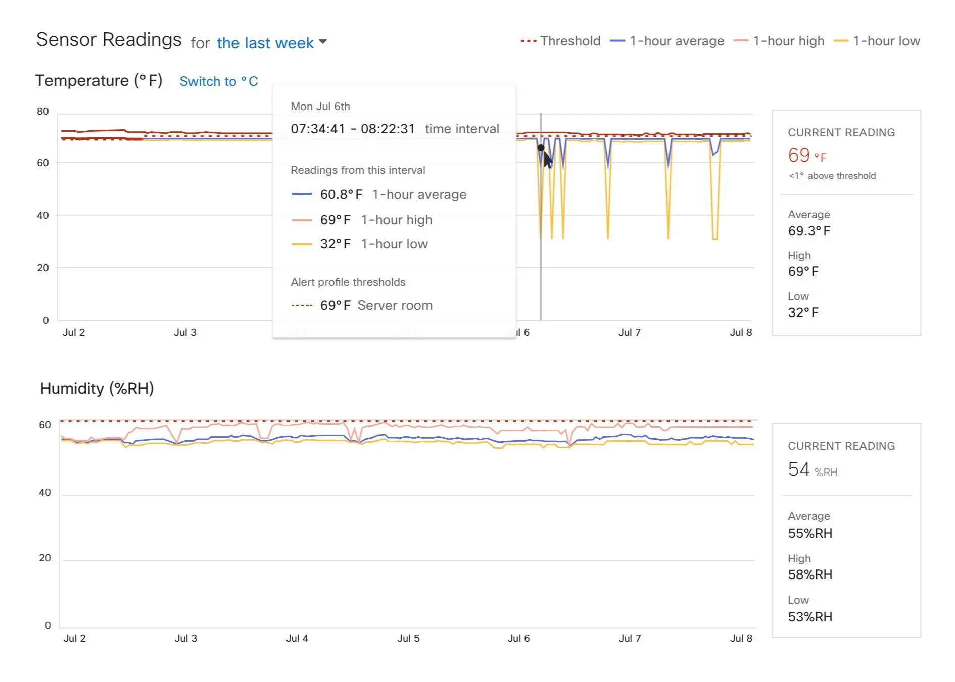
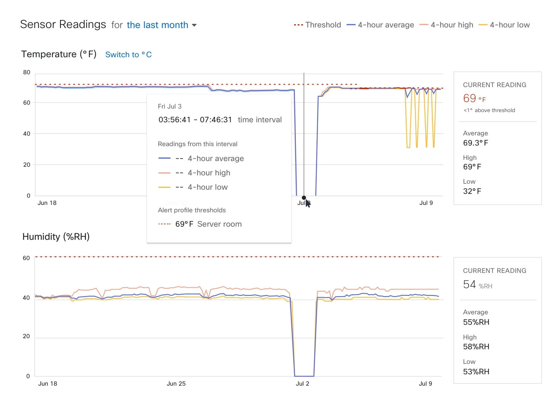
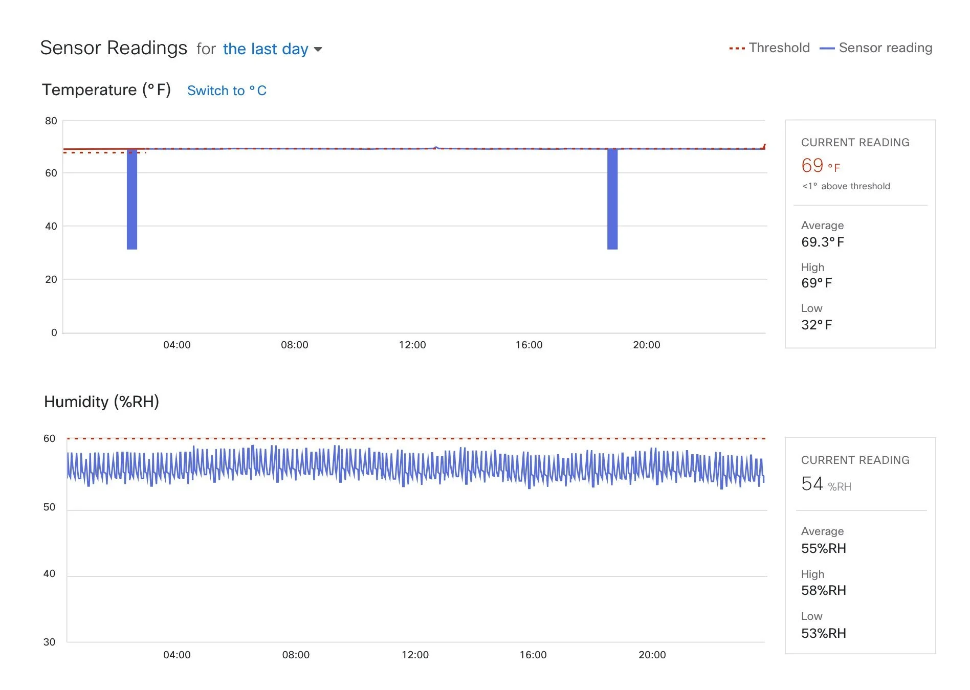
After
Downsampled data is represented by three lines for the local maximums and minimums and the average. Admins can use these to determine if the spikes are anomalies or part of a seasonal trend.
The current temperature and its delta to the alerting threshold are displayed for quick reference and can help determine if a next step is to go onsite or to change the alerting threshold
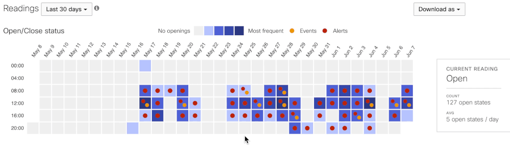
MT 20, open-close sensor
Before
Binary data points in a line graph presented usability issues when hovering
Users are unable to see high-level trends
After
At shorter time ranges, admins can quickly determine if the server room was left open or opened during an odd time, like 3AM
At larger time ranges, facilities teams can see the frequency of openings, like busiest days at the office or a retail store
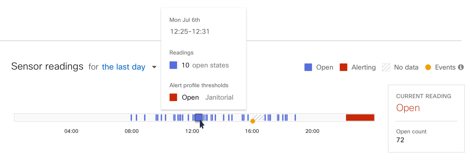
Readings from the last 24 hours
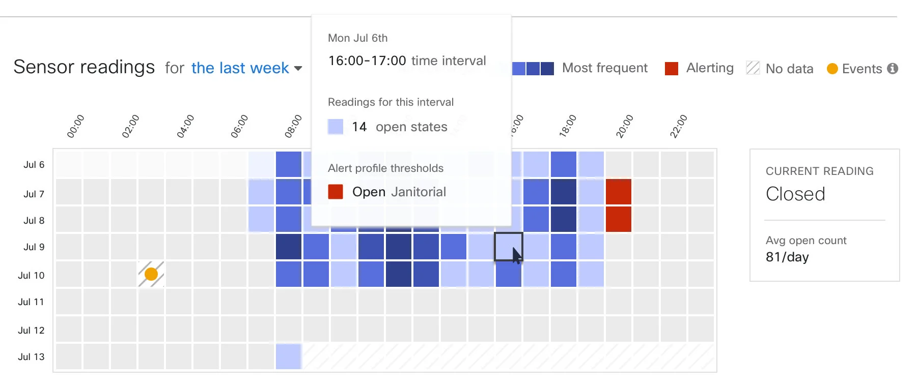
Readings from the last week
MT12, water detection sensor
Before
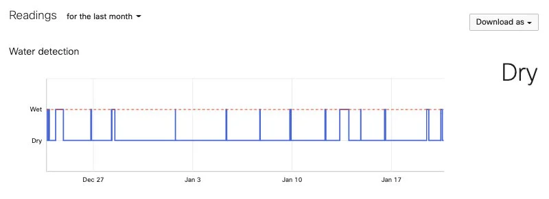
Water detections should be very rare, so the line graph mostly stays at the “dry” state and doesn’t have much to say (This graph came from a testing unit).


After
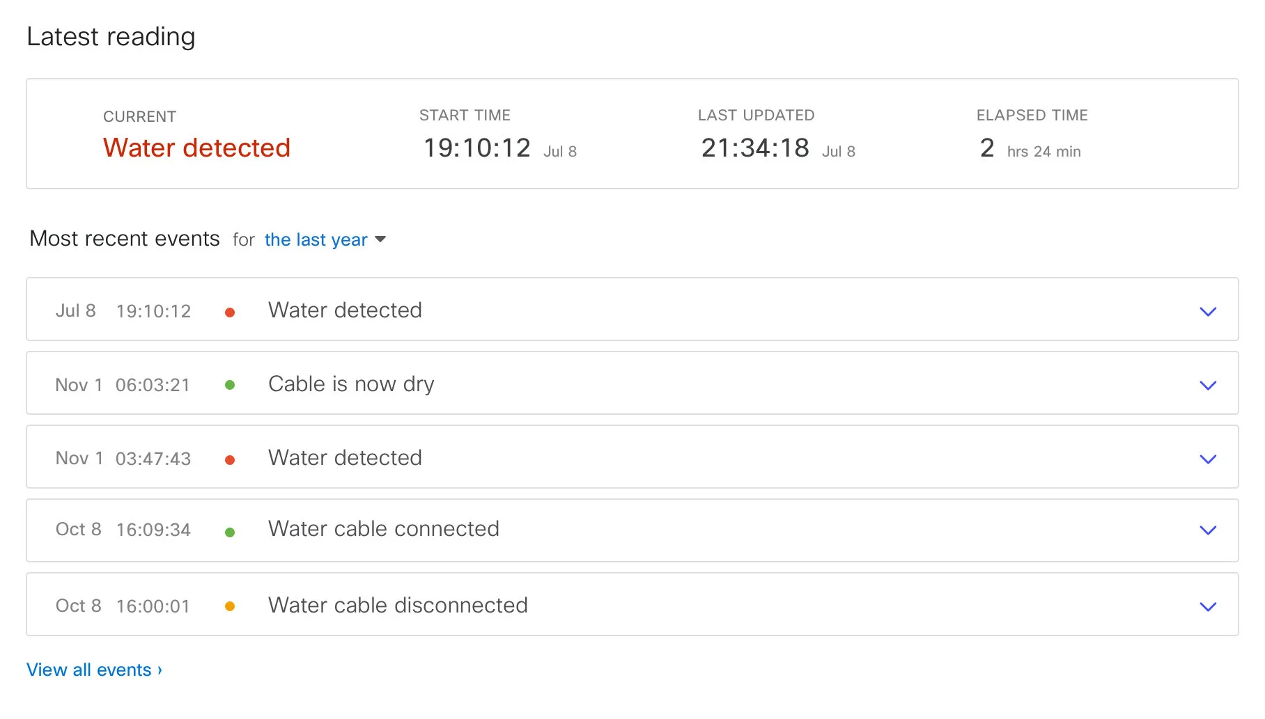
This page is really about giving users confidence that the sensor is working, even if it’s not actively alerting. The count of days since the last event and a recent events log provide guideposts of key data points.
I pared down to the essentials— just because the other sensors have visualizations doesn’t mean MT12 needs one as well
Mobile
For mobile, we built out net new detail pages for the water and door sensors with the key data points for understanding the current state. The visualizations were scaled down and adapted to use the existing components and styling for the mobile app but were not part of the initial launch due to time constraints.

Project results
MT12 and MT20 visualizations were released shortly after I left the company and received positive feedback from customers.
Additionally, I laid the groundwork for a user-centered approach for the development of upcoming sensor products and successfully integrated design into the sensors team processes.
All ● Self-service rate editing ● Subscription edits ● Automated ticket management ● Sensor visualizations